Netta Erman
project overview
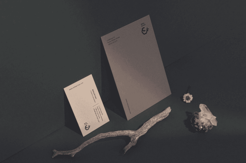
Netta Erman is an architectural studio with Israeli roots. Our goal was to combine a national symbol with a modern and rigorous identity. We decided to use organic colors, thus reflecting the style of the studio, because they emphasize natural materials. The peculiarity of logos for architectural studios is that it will stand on all layouts, so it should be memorable, but not attract much attention. We decided to make a simple outline black symbol so that it would fit seamlessly into any format.
project type
brand identity
year
2020
my role
Brand Designer
client
Netta Erman


